It has long been suggested to me that contributions to the CNCF are mostly United States centered. At times people use that to justify various things from the times meetings are scheduled for to the way certain things are prioritized. I was wondering, how true is this notion? To find out, I decided to see what devstats made available. What I found was enlightening.
Ways To Look At The Data
There are many ways to look at the data. In this case there are a several different things I pulled out.
First, there is a difference between country and global region. For example, we look at the US as one country and we look at each country in Europe individually. While it’s useful to look at it this way it’s also useful to compare regions like North America and Europe.
Second, the CNCF collects data on committers and contributors. Contributors is a more broad category that includes committers. It also includes those who comment on issues and who contribute in other ways. This made me want to see the data for both committers and contributors.
Third, contributions and contributors are different metrics to look at. One person can have a single contribution or many contributions. It can be useful to look at both of them.
Fourth, I only looked at the available data for 2022. There is data going back further. I’m interested in the latest trends rather than the all time trends. I find this to be more useful when assessing the current picture to make assumptions about today.
Fifth, the metrics we find more valuable say something about our priorities and goals. Are we looking to expand the number of contributors and the number of contributions from some in the long tail? If so, do the metrics we care about align with that? These are just example questions. Examining why some metrics are more interesting to us can give insight into our lived priorities. I’m not suggesting what they should be. Just that a little self awareness is useful.
Contributors
A pie graph of contributors broken down by country can showcase a lot of detail. The largest country, the United States, comes in at about 28% of all contributors.
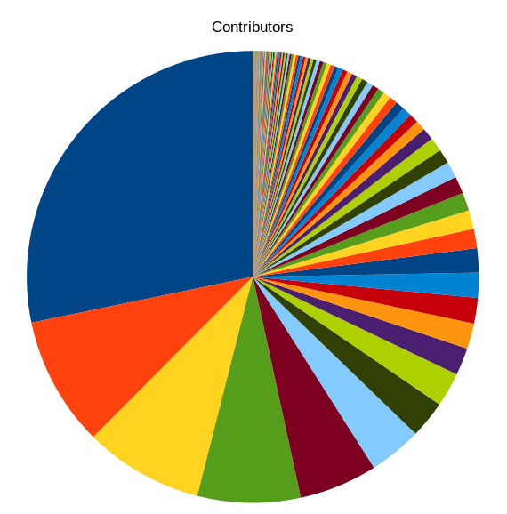
Note: no legend is included in the image because the chart would have over 100 countries listed if it included everything.
The top 5 countries by contributors are:
- United States (28%)
- China (9%)
- Germany (9%)
- India (7%)
- United Kingdom (6%)
Right from this list we can see 3 continents that cover timezones all over the world.
If we break down the countries to look at regions of the world we end up with a picture like:
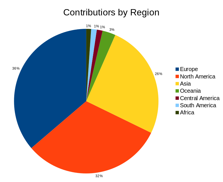
When we look at things by region we see there are more contributors coming from Europe than North America. This was a surprise for me to see.
Contributions
There’s a difference between someone who has 1 or 2 contributions and someone who has thousands in a year. It happens. The data by country here looks a little different.
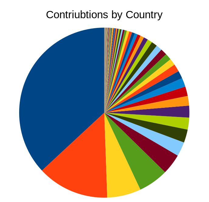
Note: no legend is included in the image because the chart would have over 100 countries listed if it included everything.
The top 5 countries by contributions are:
- United States (37%)
- China (14%)
- Germany (6%)
- India (6%)
- United Kingdom (4%)
The United States and China have a higher percent of the contributions than the contributors.
Again we can look at it regionally.
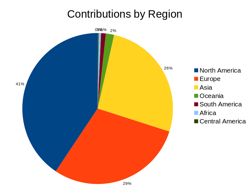
North America has the most contributions. But, it’s not a majority. In fact, Europe and Asia combined have more contributions than North America.
Committers
To look at committers instead of contributors shows a slightly different picture.
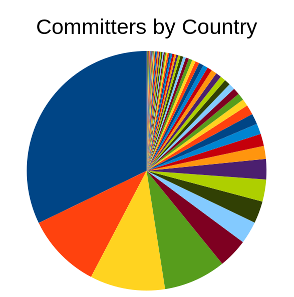
Note: no legend is included in the image because the chart would have too many countries listed if it included everything.
The top 5 countries by committers are:
- United States (32%)
- China (10%)
- India (10%)
- Germany (8%)
- United Kingdom (4%)
In this case India and Germany changed place in the top 5. The United States has about 1/3 of all the committers.
By region we can see things a little differently.
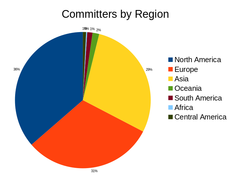
Committers are fairly evenly distributed around the world in the northern hemisphere.
Commits
Where do the commits come from? Does the layout look similar to where the committers are?
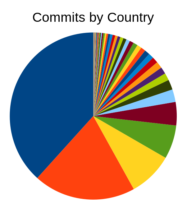
Note: no legend is included in the image because the chart would have too many countries listed if it included everything.
The top 5 countries by commits are:
- United States (38%)
- China (20%)
- Germany (9%)
- India (7%)
- Romania (5%)
Romania being in the top 5 for commits by country was a surprise to me.
Again, we can look at this by region.
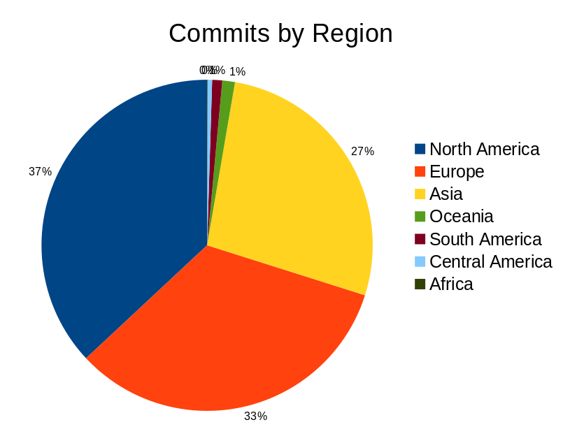
Here we see a fairly even distribution across the northern hemisphere.
Conclusions
Any notion I had that the US was a majority of contributions to the CNCF were shattered when I looked at the data.
I’m also left with many questions. For example, there are more contributions coming from people in the North America while there are more contributors in Europe. Why is this? Is this cultural? Is it due to the way the CNCF operates? Is it something else or some combination of things?
My biggest conclusion is that I have a better idea where the contributors and contributions are coming from around the world.