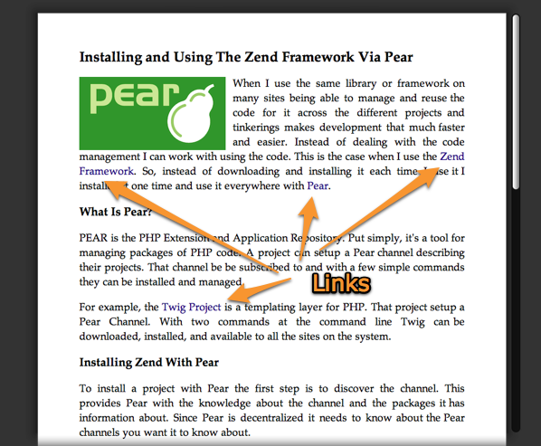
The recent release of Safari 5 brought with it the reader, a new feature designed to simplify articles and posts for users to read. Many modern web pages are cluttered with other images, ads (that pay the bills), and elements that distract from the main piece of content. The reader jumps in to help us with that by simplifying the page and focusing us on the content.
The idea of focusing us is not new. Many applications provide a full screen mode that blocks out the rest of the desktop. WYSIWYG editors, like CKEditor, include an option to take it full screen. The clears out the other clutter and lets you write without being distracted.
The problem is the new reader is not accessible because you can barely see the links.

A great example of where this is a problem is with Wikipedia. Articles on Wikipedia regularly link off to other articles. The goal is not to have all the content in one place. Instead you link off to other sources. When you cannot see the links to follow them elsewhere this becomes a problem.
This problem may not seem like much of one for people with young eyes that see well. For those with aging eyes and color blindness issues this becomes a real problem. Color blindness affects a significant portion of the population. When it comes to web accessibility this is important to take into account.
Older eyes from the growing population Internet users, also, have trouble seeing the subtle variations. Their eyes do not adjust as well and noticing the subtle links is a problem.
In any case, the Safari 5 Reader provides a lesson of what not to do with accessibility.