I’ve head a lot of great things about using CSS frameworks in site builds. Two of the more popular options I’m interested in are Blueprint and 960. When I tried to find a good comparison between the two I found, for the most part, opinion pieces on why one was better than the other. I couldn’t find a detailed enough analysis to feed my need. What is an inquiring engineer to do? I did the analysis myself.
Introducing 960
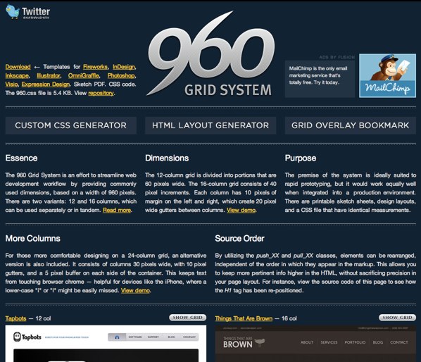 960 is what its name implies. It is a 960 pixel wide grid. The grid has 940 pixels of space for content and 10 pixel gutters on the right and left. The 10 pixel gutter on the left is very important. When a browser window is smaller than 960 pixels there is a gutter between the edge of the browser window and the content making it more readable than if the content went right to the windows edge.
Included in 960 is a 12-column grid with 60 pixel wide columns and a 16-column grid with 40 pixel wide columns. Each column has 10 pixels of space on the right and left creating 20 pixel gutters between each column. If you like even more columns, included in 960 is a 24-column layout with 30 pixel wide columns with 5 pixels of space on the right and left making 10 pixel gutters.
960 pixels is used because it makes for pretty math. All of the numbers listed here are clean numbers. Nothing ends in a decimal that a browser would try to round. Additionally, a 12-column grid is nicely divided up for the golden ratio.
Sometimes a 960 grid is not what a project calls for. For those times there is a grid generator based on 960. The number of columns, column width, and gutter width are all configurable. Once you have something your comfortable with (there is a live preview) you can download CSS generated from it.
960, also, includes a reset stylesheet from Eric Meyer and a basic typography stylesheet. 960 doesn’t handle typography. This is the basics for rapid prototyping. As Nathan Smith, the developer of 960 puts it,
One of the glaring omissions, or nice features, depending on how you look at it, is the way the 960 handles (or doesn’t) typography. There is a text.css file included, but this is mainly to ensure that there is at least a something in place, so that as you do rapid prototyping, common elements such as headings, paragraphs and lists have basic styling.
Nathan Smith is the developer of 960. This project is, for the most part, a one man show. Some features have come from others, like the push_XX and pull_XX classes that enable source reordering.
Along with the grid there are templates for all the major design programs and a printable pdf with the grid for sketching. The 960 grid is dual licensed using the GPL and MIT licenses.
Introducing Blueprint
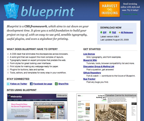 The Blueprint grid is a 950 pixel wide grid with 24 columns. Each column is 30 pixels wide with a 10 pixel gutter. The 10 pixel gutter is on the right side of each column. This grid, also, nicely works with the golden ratio and in 950 everything ends in nice round numbers.
If a 950 pixel grid isn’t right for you, included with Blueprint is a Ruby script that can generate different grid sizes. Don’t worry if you don’t know Ruby. There are detailed instructions and it works like other command line applications. If you are looking for web based generators you need to look no further than the community of developers around 950.
The grid provides source reordering with push, pull, append, and prepend classes. This is handy when you want to have your source in one order for good SEO and your presentation in a different visual order.
Like the 960 grid reset, Blueprint provides a reset stylesheet based on the work by Eric Meyer.
This is where the similarities between 960 and Blueprint end. Blueprint goes beyond a grid to provide much more. Some of the additional elements in Blueprint include:
- Typography - Provides typography size and spacing defaults.
- Form Styling - Default styling for forms and some classes that can be used to add to forms.
- Print Styles - Print styles are important and often overlooked.
- Plugins - CSS (and sometimes images) for buttons, tabs, and sprites.
A PSD template is available for Blueprint from the Blueprint repo. If you go beyond the Blueprint repo there are generators for CSS files with different dimensions and templates for other tools from the community of Blueprint users.
Blueprint is the work of a team. The original creator has handed Blueprint off to two admins and several contributors. Much of the CSS used comes from the work of big names in the design community.
Blueprint is distributed under the GPL and a modified MIT license.
My Notes
While reading through the sites, looking for the similarities and differences, and seeing what I liked or disliked about these two frameworks I took some notes that some may find useful.- Blueprint content butts up to the browser window on the left when the window is smaller than the content area. This can cause problems for readability of content. A designer can add a gutter to the left side of the content to account for this. I tested several sites and often found the text butted up to the left side of the window.
- In most of the designs I work with the designer has chosen the typography, look of the forms, and other visual elements. A framework that provides these is not useful when a designer is customizing the look for the branding of the site or the organizations branding is dictating parts of the design.
- If someone is not a designer but is throwing a design together the defaults provided by Blueprint would be very handy. There are far to many ugly developer sites because of bad defaults.
- I don't really like the gutter all being on one side of the column in Blueprint. It feels unbalanced. Like a person who has short hair on the right side of their head and long hair on the other. Maybe it's just me but it doesn't feel right.
Conclusion
Blueprint and 960 are very different setups. They offer different features and have a different purpose. Picking between them is more a matter of preference. The approaches are just different. 960 is additive. It provides a grid and the design elements are added to your CSS. Blueprint is subtractive. It provides a lot of functionality. If you want to go a different route you need to subtract or override what you don't want from Blueprint.Both solutions are solid, well tested, and well used. With either choice you aren’t going to go wrong.